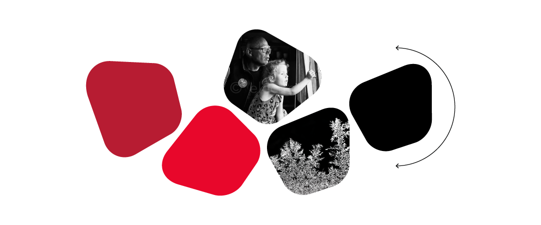
LMT identity graphic core elements.

Symbol elements

We use elements from LMT logo Latvia symbol – in the defined brand CMYK or Pantone colours.

We use symbol elements for corporate representation materials, souvenirs and clothing.

The ratio of the LMT logo symbol to symbol elements is not less than 1:10.

We use monochrome colour symbol elements in one of the brand colours we use in situations, where colour print restrictions exist.

Full symbol elements

Full symbol elements are LMT logo Latvia symbol full forms – in the defined brand colours. We use the full symbol elements we use as a form of tactical information and as a space structurer (as a form under copy or an image mask). In communication, we use only four cornered full symbol elements. We can increase the size of full symbol elements and rotate them, preserving their basic form. In cases when we use the full symbol element we use as a spatial form under copy or an image mask, there may only be one in the layout and it is framed so that only corner of it is visible.

Framing full symbol elements

When we use full symbol elements as space structurers, we frame them.

  • In cases when we use the full symbol element as a space form under copy or an image mask, there can only be one in the layout and it is framed so that only one fragment of its corner is visible – 1/3 of the corner radius.

Tactical information

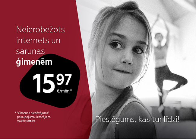
We position tactical information within the full four corner elements of the LMT logo symbol for which we use one of the three brand colours: dark orange, dark red or black. Transparent filters can be used for full symbol elements, retaining LMT brand colours. The full symbol element of tactical information may contain a price, icons or three words at most. We centre copy. Placing copy, we respect secure space. The positioning of tactical information within a layout depends on the size of the copy and visual element in the specific layout. A layout may not contain more than one item of tactical information. A full symbol element must visible in the layout at its full size.

  • Price
  • Copy information
  • Tactical news with a special price in a specific period of time.

  • Tactical news with a special offer in a specific period of time.

Icons

The full set of LMT icons is available at: feathericons.com

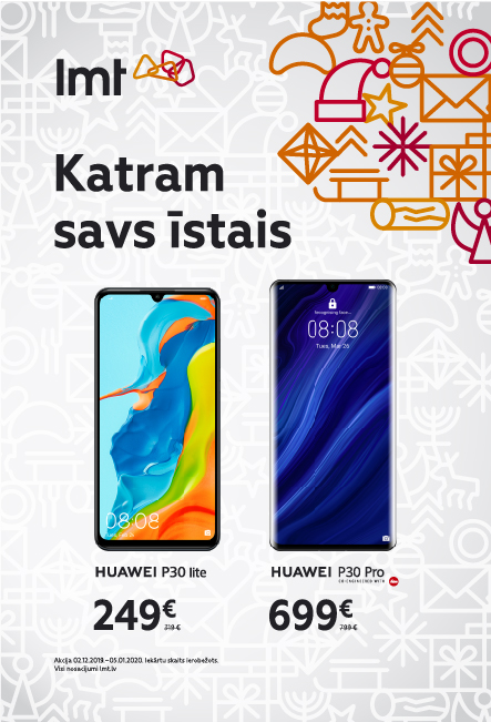
For icons, we use one of the brand colours. In creating new icons, we maintain the same style as the icons in the LMT icon set. Icons are used to make copy clearer.

Inserting icons into materials, we observe the densities or sizes of icon lines, in order to form a mutual sense of logic between the sizes of icons.

Increasing the size of icons, the density of lines increases proportionally. For example, doubling the size of icons, the density of lines doubles.

Illustration

We use illustration to illustrate or explain copy. We create stylistically flat and/or spatial illustration, using lines and no more than two of the brand colours.

Lines and spaces

We use the visible types of lines in communication, tables, graphs and other materials, where structure and division are required. The use the background pattern of lines in spaces. For the line colour, we use one of the LMT brand colours.

Examples

1  From  1

We use the full element of the logo symbol under the written section so that it is more clearly legible.

We frame the full symbol element in the space so that only one part of one corner is visible.

When we use the full element of the dark red symbol on a black and white image, we create it from the full elements of two symbols, which we place on top of one another. We form the lower one with Overlay and the upper one with the Multiplay filter

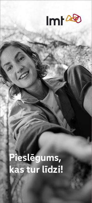
In layout where darkening or lightening of the image is sufficient for the copy to be legible, we don’t use full symbol elements.

Download

Icons
Basic set
Illustrations
Innovation .ai file