In order to form a distinct contrast between sections of copy, we use the following letter size proportions – assuming that the basic copy is 1. We form the copy with automatic gaps between rows. In headlines, if necessary, we can also use gaps that are equal to the height of the letters.
Typography
The LMT identity typeface is Geometria Narrow.
Geometria Narrow Light
ABCDEFGHIJKLMNOPQRSTUVWZ
abcdefghijklmnopqrstuvwz
Geometria Narrow Bold
ABCDEFGHIJKLMNOPQRSTUVWZ
abcdefghijklmnopqrstuvwz
Formatting
Headline
×
3.00
You’re changing.
Latvia is changing.
Latvia is changing.
Sub headline
×
1.50
LMT values – passion, development, cooperation
Body copy
×
1
Just like conversations, the Internet is also freeing itself up and becoming available to everybody, everywhere.
Disclaimer
×
0.50
We have grown up together with Latvia, and our home is here. We’ve built a network so that conversations can take place anywhere, anytime. Now, you no longer need to count your call minutes, and can focus on new opportunities. Just like conversations, the Internet is also freeing itself up and becoming available to everybody, everywhere. This makes it possible to do things faster and more conveniently. To do them yourself and inspire others. We stand for growth. For opportunities to improve life for everyone throughout Latvia. Your daily life is changing and so are we. What remains constant is our desire to keep working so that Latvia thrives
Positioning
Line up copy against the left-hand side and position it on the left-hand side of the layout, except tactical news and explanatory copy under device images, illustrations or icons, HTML letter and homepage buttons and navigation links, where copy centering is permissible.

Headline
In headlines, we use six short words or 40 symbols at most. We create highlights using a Bold version of the font or using one of LMT’s brand colours.

Names
In the names of LMT products and services, we always write the first word with an initial capital letter. In headlines, we also highlight the names of products and services with the font Geometria Narrow Bold.

Legal information
In disclaimers, in accordance with the legal principle, we highlight product names using Geometria Narrow Bold.

Explanatory copy
In explanatory copy under equipment images, illustrations or icons, copy centering is permissible.

Prices
For price formatting, we use Geometria Narrow Bold numbers, but write price terms and conditions with Geometria Narrow Light small letters and we use a ratio of 1:5.
-
For cent numbers, we use automatic superscript formatting, then we line these up against the upper edge of the euro. For price deletions, we use automatic strikethrough.
Tactical news
Tactical news is a unique information carrier, which refers to a specific period of time, offer or special price.
- News
- Free space
-
For tactical news, we use Geometria Narrow Bold small letters. It consists of three words at most. We centre the copy in full symbol elements. For a price offer in tactical news, we use price formatting.
-
Posting news or price, free space must be left, which is 25% or 1/8 of the total full symbol element area.
Examples
1 From 1
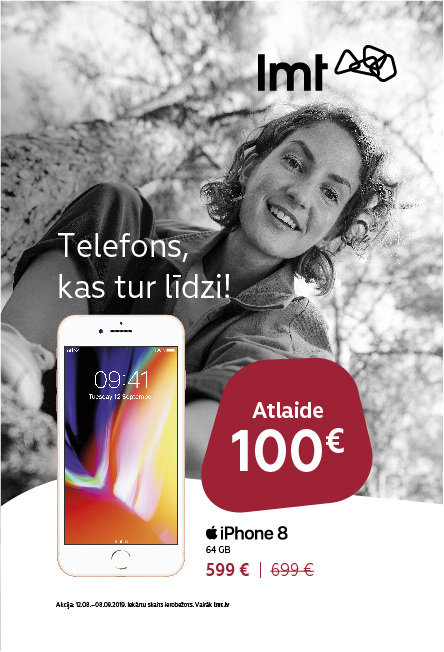
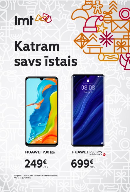
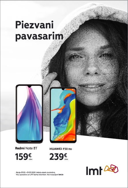
The tactical message is centred in the full element of the logo symbol. We observe free space around the tactical message.
So that the copy on the image is more clearly legible – we darken or lighten the image under it.
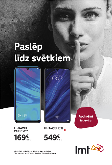
To make the slogan more legible and eye-catching, we can use the Geometria Narrow Bold font.
The copy of a tactical message is inserted into the full symbol element, observing free space.
Price formatting must be observed for prices.
Download
Geometria Narrow Desktop
LV, ENG, RU font
Geometria Narrow Webfont
LV, ENG, RU font