Colours
The brand’s bright tones signify goal-orientation and energy, as well as matching Latvia’s natural colours in autumn.
Basic colours
HEX #FF6A13 RGB 255 106 19 CMYK 0 55 100 0 Pantone 1585
HEX #FA4616 RGB 250 70 22 CMYK 0 70 100 0 Pantone 172
HEX #C8102E RGB 200 16 46 CMYK 0 100 80 5 Pantone 186
HEX #9D2235 RGB 157 34 53 CMYK 0 100 70 28 Pantone 201
HEX #000100 RGB 0 1 0 CMYK 0 0 0 100 Pantone Process Black
Secondary colours
Hushed grey tones, which balance the active and bright brand colour. Unobtrusively, they are in contrast to orange and red – augmenting and enhancing these colours.
HEX #c8c9c7 RGB 200 201 199 CMYK 8 5 7 16 Pantone Cool Gray 3
HEX #b1b3b3 RGB 177 179 179 CMYK 13 9 10 27 Pantone Cool Gray 5
HEX #97999b RGB 151 153 155 CMYK 20 14 12 40 Pantone Cool Gray 7
HEX #75787b RGB 117 120 123 CMYK 30 22 17 57 Pantone Cool Gray 9
HEX #53565a RGB 83 86 90 CMYK 44 34 22 77 Pantone Cool Gray 11
Usage
We use the brand’s colours together with an image or the colour white. In order to avoid the aggressiveness of red and orange tones, we use them in proportionally small areas.
In a campaign, we use no more than one of LMT’s bright basic brand colours.
In LMT communication, dark orange (Pantone 172) and dark red tones (Pantone 201) should be chosen in large colour spaces.
We only use a secondary colour, if necessary, for packaging, accents, tables, etc., where basic colours are inadequate. We can also use gradation for the secondary colour palette.

A black and white background or image makes up 70–100% of the total space.

Brand colour: 10–50% (using one of the Transparency filters: Multiply; Hard Light, etc.).

Brand colour gradation: 10–30% of the total layout space. Gradation: 75%, 50%, 25% of the brand colour.
Examples
1 From 1
When we use the full element of the dark red symbol on a black and white image, we create it from two full elements of the symbol, which we place on top of one another. We form the lower one with Overlay and the upper one with the Multiplay filter in order to retain the basic tone of the brand colour. In cases when the background image is too dark for the lower element, we use the Screen filter.
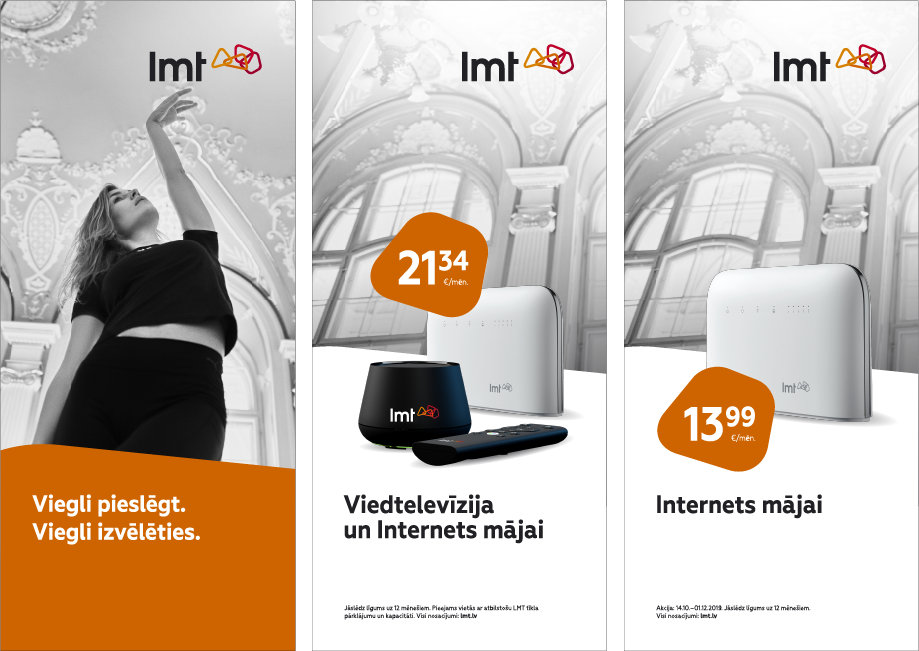
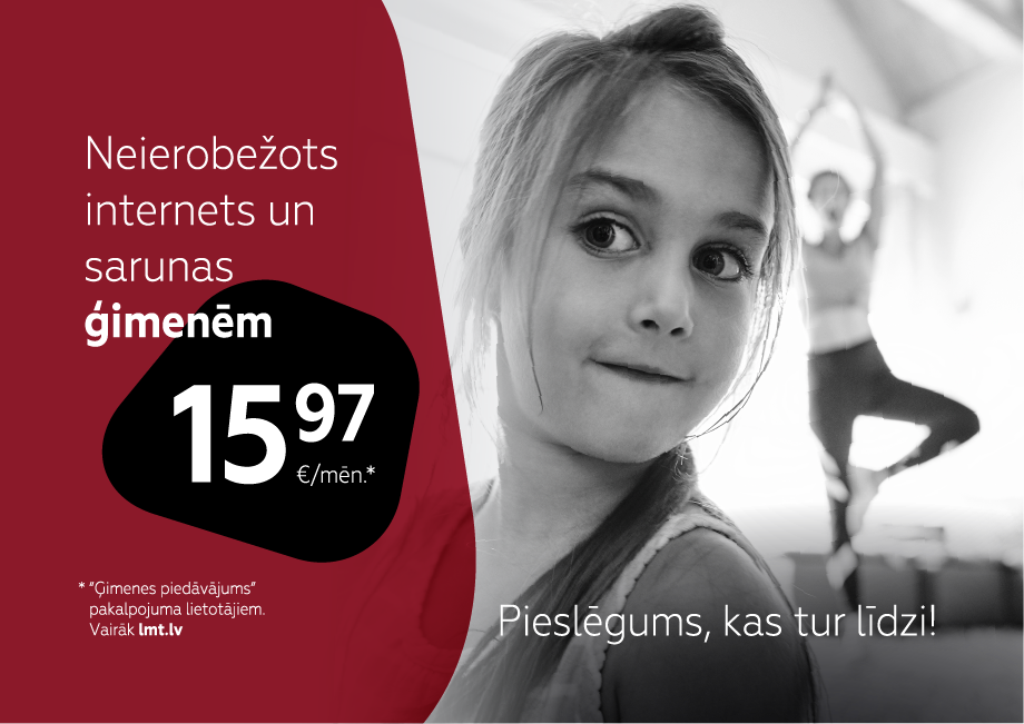
Lai radītu vienotu kampaņas vizuālo valodu, izmantojam vienas un tās pašas krāsas dažādos materiālos.
The drawing is created from icons that correspond to LMT graphic guidelines. The colours defined in the LTM brand guidelines are use in the drawing.
The white full element of the LMT logo is used visually.