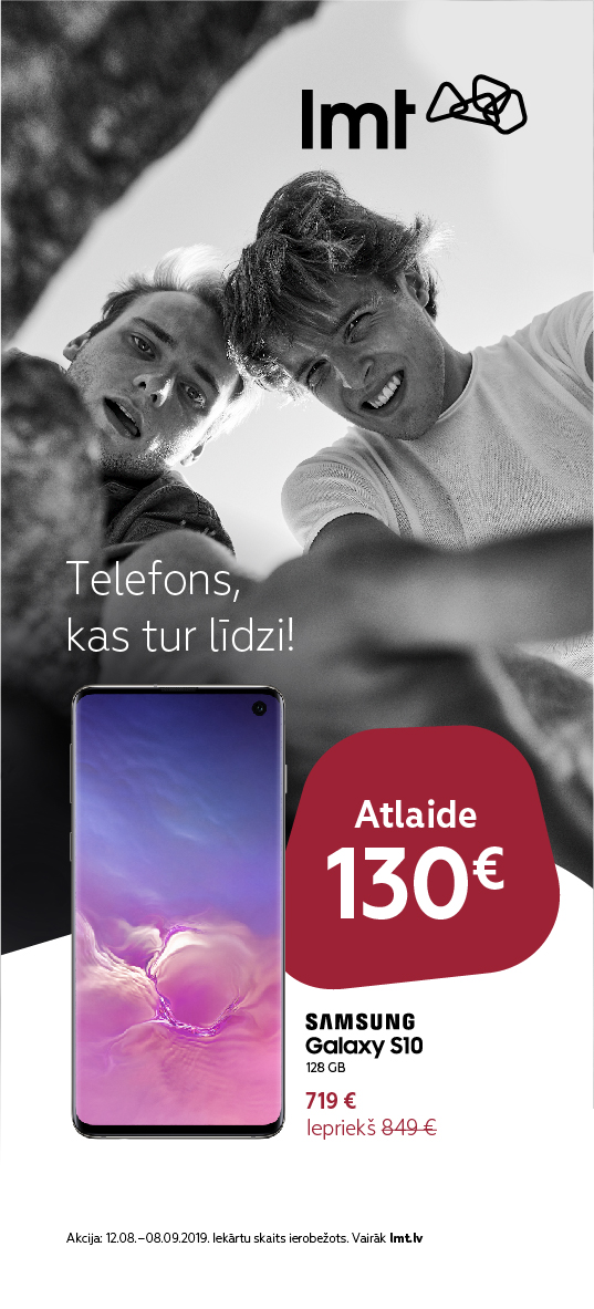
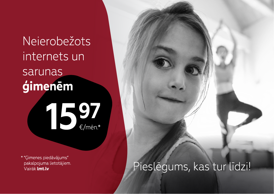
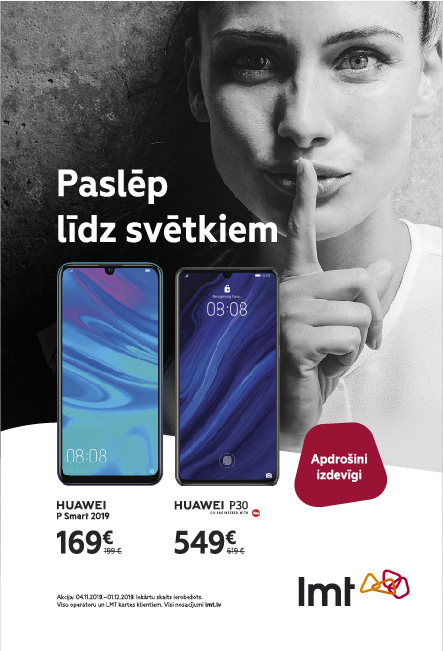
Logo
The stylised contours of Latvia with its four cultural-historical districts reflects the uniqueness of LMT – we’re one of us.
Logo with slogan
We use the logo together with THINK – DO in situations, where the LMT brand image is being advertised, as well as in sponsorship and public relations materials.
We don’t use the logo together with THINK – DO in sales promotion campaigns for 5G, product and service packages, and appliances – phones, computers, televisions, etc., and in retailing interior and shop display designs
We never use other words instead of THINK – DO including the names of other LMT products. For example: LMT suggests, LMT recommends, LMT Smart TV, etc. If it is necessary to use such combinations of words, then we write them in the layout as words.
We never use the LMT logo as a copy component.
Secondary logo
We use the secondary monochrome colour logo in one of the brand colours. We also use the monochrome colour logo in situations in which colour print restrictions exist and when the full colour logo is not distinctive enough against a light or dark background.
Symbol
For representation materials, souvenirs, clothing informal occasions, it is permissible to use the symbol without the LMT word mark. In situations where the full logo has already been used once, the symbol can be used separately as a graphic element of the brand. We primarily use the full colour logo.
- Full colour symbol
- Monochrome colours symbol
-
The full colour symbol is to be printed in the defined brand CMYK or Pantone colours.
-
We use the monochrome colour symbol in one of the brand colours. We also use it in situation when colour print restrictions exist.
Spaces
We always adhere to this area surrounding the logo. The secure logo space should not contain headlines or other design elements. In this space, the background image must be monochrome.
Placement
When placing the LMT logo in a layout, the ratio of the logo to the layout and the free area surrounding it must be respected.
- Outdoor layouts
- Posters and press layouts
-
1/5 h – the secure area of the logo, which should not contain headlines. Any image in this space should be monochrome.
1/7 h – space which should not contain headlines.
-
Example A4
The secure space of the logo which should not contain headlines must be respected. Any image in this space should be monochrome.
Dimensions
Using the logo in small sizes, its legibility and clarity must be preserved. In print and digital materials, the dimensions should be as small as is allowed.

In print works, the minimum recommended size of the full colour logo is 7mm.

In print works, the minimum recommended size of the monochrome black and white logo is 5mm.

In digital media, the minimum recommended size of the full colour logo is 20px high.
Usage
Awareness of LMT must be built continuously, therefore we strictly adhere to set visual identity principles.

We don’t replicate or transform the word mark!

We don’t change proportions, compressing or stretching the logo!

We don’t change the horizontal arrangement, rotating or angling the logo!

We don’t form an external contour!

We don’t change the colour of the logo!

We don’t change the proportions of the brand message!
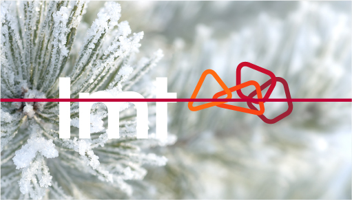
We don’t use the logo with the white word mark set against a distinctly light image. In such cases, we use the black word mark and make sure that the background is not speckled.
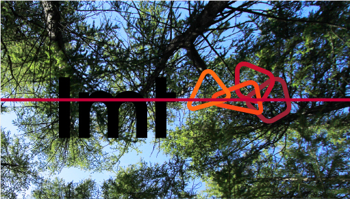
We don’t use logo with black word mark on a distinctly speckled or bright part of the image. In such cases, the correct the image in place of the background, creating a good contrast and legibility in relation to the logo.
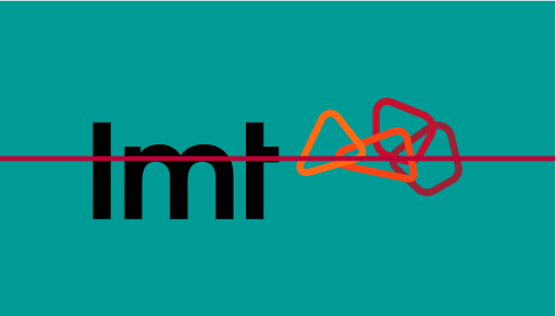
We don’t use the full colour logo against a background colour that makes it difficult to read the logo! In such cases, we use the secondary monochrome white logo.
Product logos
In creating materials for Tower games, 5G, LMT Stream and LMT Card, we use the logos created for them.


