If possible, we primarily us the animated logo on a black background. We can also use it on a white background and images (see Usage on backgrounds).
Logo animation
The animation embodies the interaction between two planes: Think and Do. This chimes with LMT’s brand slogan “Think – Do”. Each plane has been given its own graphic language. “Think” plane – the background graphic elements (orange points) are free, imperceptible, mobile and changing just like thinking. “Do” plane – stable and secure LMT logo letters.
Animation for advertising
5" animation
3" animation
1" animation
Neutral animated background (Wallpaper)
We can use this background, for example, to design screens for conferences. We do not use it in advertising materials.
Usage on backgrounds
In conformity with the terms and conditions for the use of the LMT logo, we only use the full colour version of the logo animation against a black or white background. It is not necessary to use the monocolour log, because the digital environment does not restrict the choice of colours. In individual cases, the use of the monocolour animation is permissible ‒ a white logo against a black background or black on white. It is also permissible to use the monocolour logo animation on an image ‒ a white logo against a dark background or black against light.
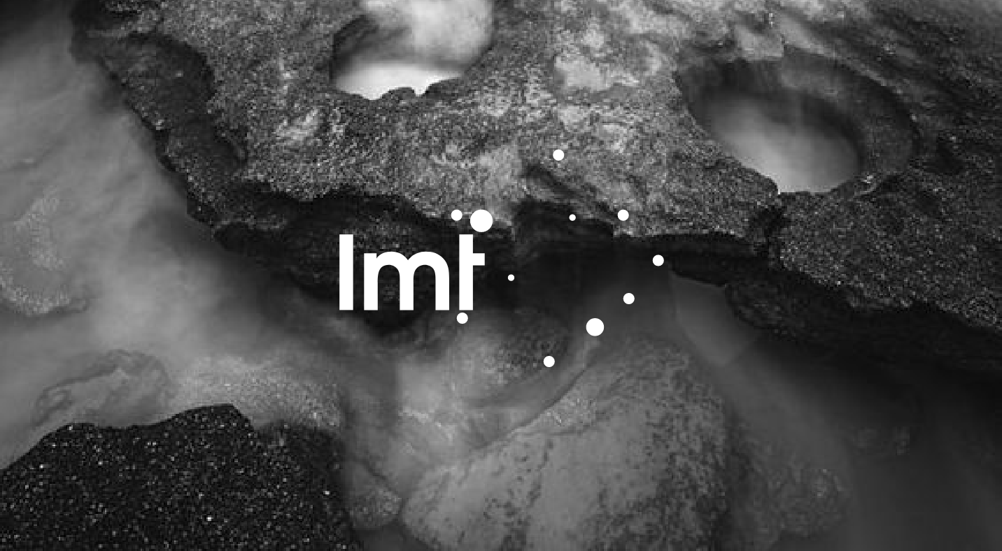
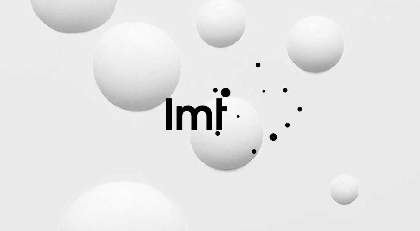
Free space
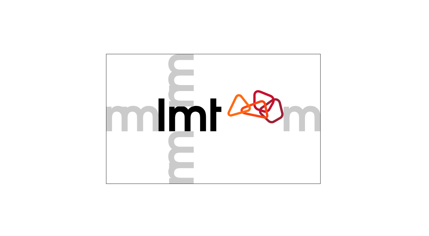
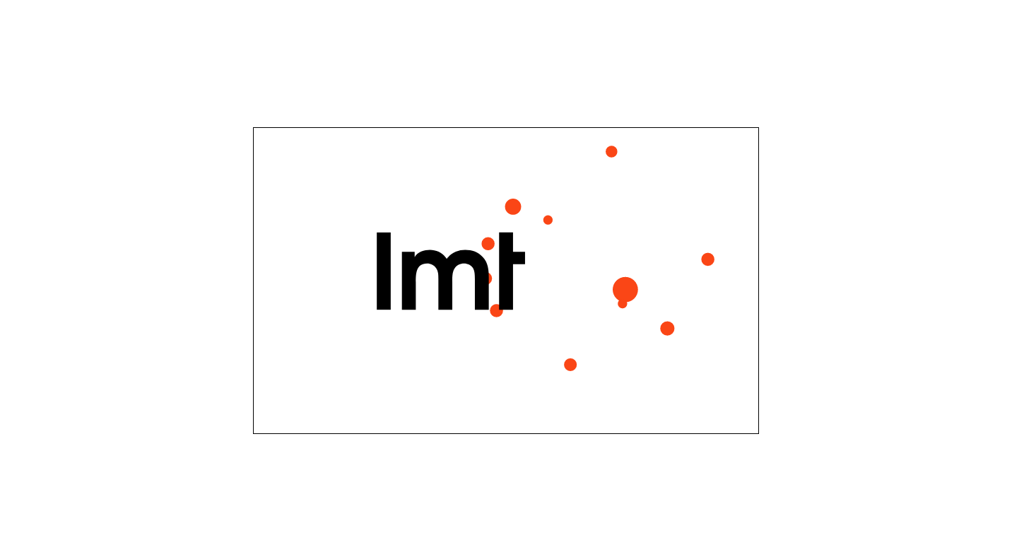
When positioning the LMT logo in a layout, we ensure free space around the logo – the edges of the layout must not be nearer than the specified distance. In a layout, the logo may be smaller. For an animated logo, the free surrounding space is bigger than for a static logo.
Positioning
Here we specify the main formats in digital communication. In these examples, only the centred logo positioning is used. In this manner, we use the logo in all LMT logo animations. In addition, we use the 1” logo animation at the sides of formats in accordance with the rules for the use of the static logo.
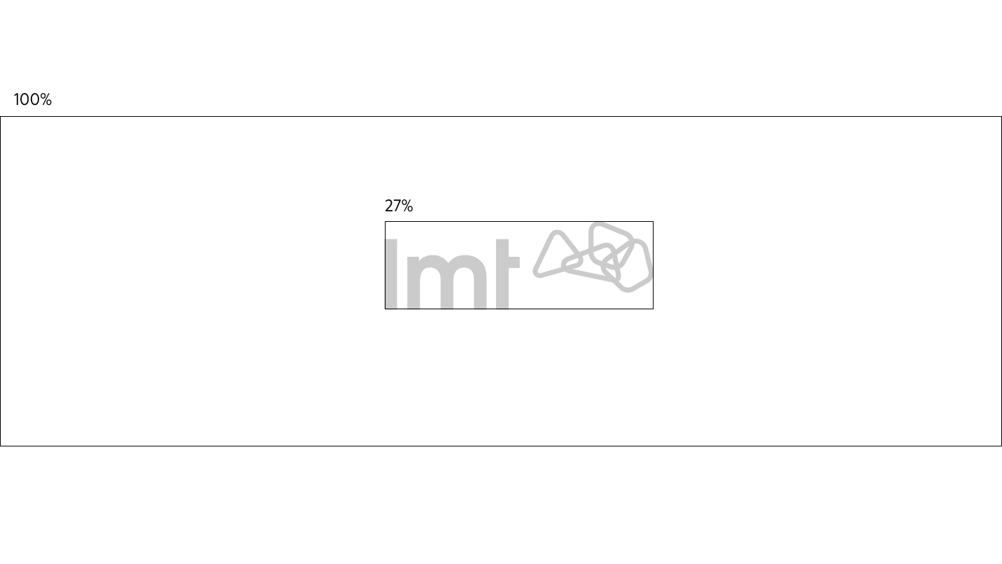
TV screen (16:9)
In this example we use the most common format, whose aspect ratio is 16x9. The logo positioning guideline is its optical centre on the bottom part of the letter T, which coincides with the actual centre of the whole field. In this field, the logo is 27% of the format width.
Animation for banners
He we show the most common format types: distinctly horizontal, vertical and with equally long edges. If the technical specification and content allow, we can also use the 3” version. It is recommended to use the 5” version on banners. On banners, we use the animation without sound.
8:1
The logo positioning guideline is its optical centre on the bottom part of the letter T, which coincides with the actual centre of the whole field. In this field, the logo is 34% of the format height.


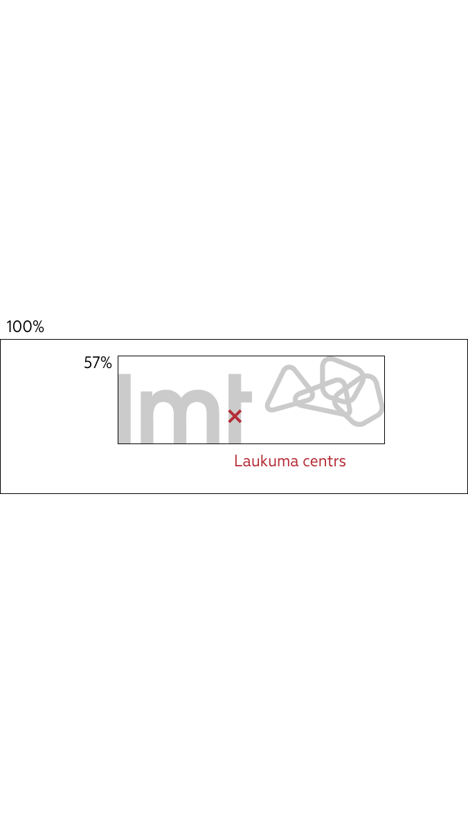
9:16
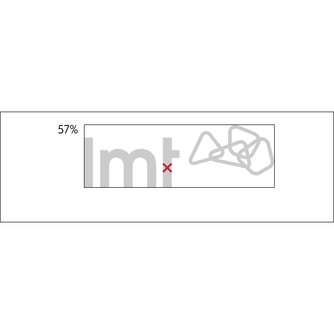
The logo positioning guideline is its optical centre on the bottom part of the letter T, which coincides with the actual centre of the whole field. In this field, the logo is 57% of the format width.
1:1
The logo positioning guideline is its optical centre on the bottom part of the letter T, which coincides with

Logo animation with copy
We can also ad text to the logo animation in the manner shown in these examples.
Animation for additional elements
In the digital environment, we can use animation for other graphic elements: names, icons and instructions. Here we define the basic animation principle, which we recommend using in all cases unless there is another special task for the movement of the object.
Object appearance 0,4”, object disappearance 0,2”